| |
|
|
|
|
|
|
|
|
|
|
|
|
|
|
|
|
|
|
|
|||||||||||||
| |
|
||||||||||||||
| |
|
|
|
|
|
|
|
|
|
|
|||||
| |
|
|
|||||||||||||
|
from the February/March 2001 issue of Camera Arts
In the first half of this article I discussed the split tone effects – tonal shifts and exotic coloration - which have been with black and white photography since its earliest days. In this article I will offer formulae and procedures for attempting to deliberately achieve these results in the darkroom with modern materials. I use photography as a point of departure: like Frederick Sommer, I prefer to view a photograph as "a thing seen" in its own right, rather than considering it as a document of "a thing seen." This is a disengagement from viewing a photograph for its content alone. An image has its own reasons for being – perhaps possessing its own kind of intelligence. I prefer to think of myself in the role of steward or mid-wife: responsible to the image, but not in charge of the image. I teach in my workshops upwards of a dozen different toning techniques - including numerous split-toning processes. Toning, especially split-toning, is an extension of the process of discovery which is photography as I understand it. None of these processes respond well to willful intent: the expectation that a certain predetermined "look" or result will be achieved on command. If I knew beforehand how a given image would tone, I wouldn’t bother to do it – I would already understand it! My interest in these processes is more in "revealing a beauty lurking within,” what Japanese potters call “shibui” – a certain something "that emerges spontaneously...when one entrusts oneself completely to the materials and the tools...."1 The processes for achieving split effects are extremely varied and constantly evolve as manufacturers reformulate their papers. They also vary widely from practitioner to practitioner: Olivia Parker, for instance, printed on Kodak Azo paper and achieved beautiful splits with strong, warm selenium. Tim Rudman has written an entire book on the benefits of printing with lith developers and the enhanced toning potential, especially split-toning, that is subsequently possible.2 Many practitioners have utilized a selective bleaching and toning method (Phillip Borges, for example) that allows certain areas of the image to tone while other areas remain unaffected. The split-effects that Linda Butler is achieving result from the combination of Kodak Polytoner and Forte’s Fortezo paper 3, while Thomas Joshua Cooper utilizes a gold-based split-process. There are no absolutes here: this ground is largely unexplored and your own experimentation may well render something completely unique and stunning.
My current interest in split-toning is largely confined to gold-based chemistry. I utilize formulae from the late 19th and early 20th centuries that allow for color shifts according to the depth of silver on the print’s surface. I think of it as a topographical readout of the print’s silver density, rendered in color. These gold-based processes have the added benefit of greatly enhancing archival permanence – arguably as archivally stable as gelatin silver can attain. Within any given split-process, specific colors are always related to a specific density. These colors will show themselves consistently and repeatedly from one version of the print to the next, as long as separation of the densities are maintained and repeated. However, minor and visually undetectable differences will always show up as variations from one print to the next – which means that while results are broadly reproducible, prints are always one-of-a-kind. To this extent, split-toning shares with historic, or “alternative,” processes (such as gum, albumen and even platinum), a hand-made quality and “one-of” uniqueness. In my workshops I refer to toners as alternative processes for commercial papers. While there are indeed many options available, I prefer to treat the entire print as a whole, rather than selectively picking and choosing which areas to affect. This sidesteps "masterminding" the final result. I would rather allow the materials and processes to show me what they want to do. I am either interested in the results or I’m not: this is communication with an image, as I understand it. Split-toning is compelling at least in part due to its effect on the sense of space within an image. Olivia Parker says it "expands the space within the photograph ... integrates disparate objects ... a shadow can liquefy or become three-dimensional."4 Robert Hirsch says it "can create an unexpected and subtle sense of spatial ambiguity. Some photographers claim that split-toning can unify objects within a composition and give it added depth.... Others ... say it fractures the continuity." 5 In certain images I find a compelling, almost three-dimensional depth and sense of space. It depends entirely on the image in question, and every image is different. Almost every step in the printing process has an effect on the resulting split-toned image. Choice of papers, developers, and even the fixer, are significant. For example, certain papers will respond to certain toning processes and not at all to others. Cold tone papers (such as Ilford Multigrade, Kodak Polycontrast and Kodabromide etc) have emulsions based primarily in silver-bromide. Warm tone papers (including Kodak Ektalure and Azo, Agfa Portriga, Forte Fortezo, and Ilford Multigrade WT) contain two different sizes of silver particles – both silver-bromide and silver-chloride, and they are often called chloro-bromide papers. These two different size molecules respond to toners differently and at different rates and this enhances their ability to split when toned. Emmet Gowin suggests it is these smaller silver-chloride molecules that are most responsible for the color in a black and white photograph. Gowin recently elaborated on his intuitive understanding of the chemical dynamics that underlie split-toning. He believes particle size is always involved with color perception in black and white photographs: and that it is the smallest particles that refract the most color. He gave as an example a common observation while developing warm tone papers: print color is warmest with the shortest development times – i.e. when the mass of silver has been “grown” the least by the action of the developer. Gowin, who teaches photography at Princeton, has even gone to the trouble of investigating with his students the structure of silver molecules under an electron microscope.
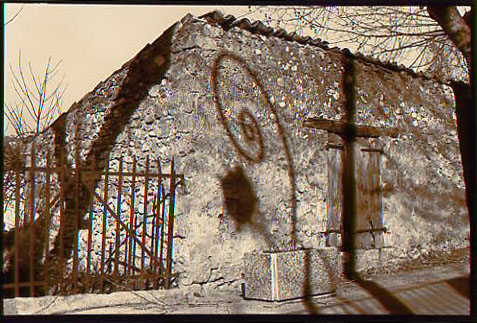
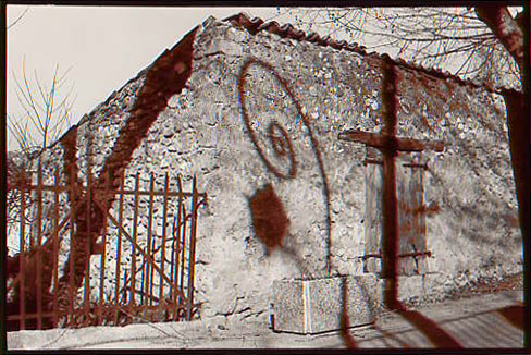
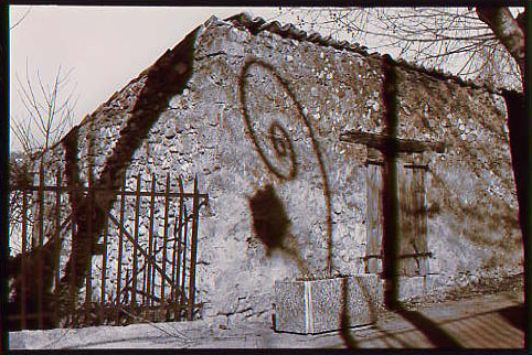
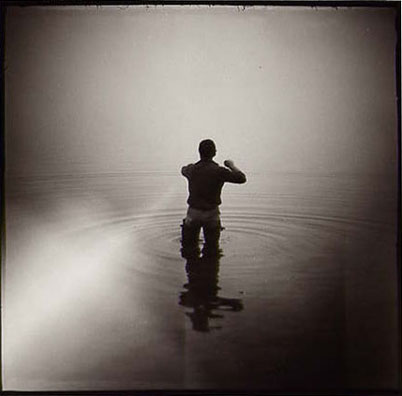
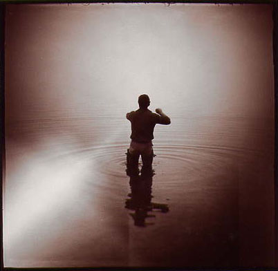
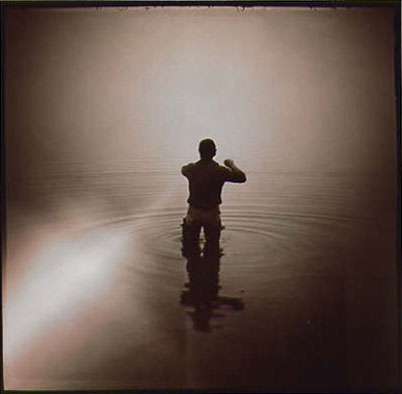
Photograph by Jonathan Bailey. Rangeley Lake, Maine. The image was created with a $2 "Diana" camera (with light leak). The top photo is the original, untoned print. The middle photograph illustrates the GP-1 Gold split-toning process. It illustrates its appearance after selenium toning showing inititial splits of plum-red and blue-green. The bottom photograph shows its appearance after treatment in Gold (GP-1) Toner. Note the rouge in transition between light blue and darker green. Notes on Printing for Split-Toning: I use a 100% hydroquinone developer called "HQ Warm Tone." (made by Zonal-Pro), that is said to aid all papers in accepting toners. I also use Kodak's Selectol-Soft developer when I need to fine tune contrast control. I always use non-hardening fixers. Outside of their dubious benefit for prints, hardeners can interfere with the action of toners. I suggest using SPRINT fixer – Janice Wendt, who designs Forte’s Fortezo paper for the American market explained to me in 1998 that Sprint Fix apparently contains buffers that cause papers to accept toners unevenly - significantly enhancing their ability to split-tone. Avoid changing brands of chemistry midstream. It will likely change the results you achieve. Keep the prints per liter of working solution low. Complete fixing (and clearing) is vital! Wash your prints thoroughly! Completely clean prints are crucial to good results; toners will graphically demonstrate any shortcomings! And perhaps most importantly: keep good notes! I note in pencil on the back of each individual print the exposure specifics and each subsequent step through the toning processes. This is the only hope I have in re-tracing my steps that lead to a successful result. Nothing hones printing and darkroom skills like the need to replace a sold print! Most of the time I have no idea which process an image will respond to beforehand. I usually print an image on at least a couple different papers within a subtle range of contrasts and densities, in order to begin to see where the image might want to go. I will usually work on a number of negatives over the course of several printing sessions. I then begin to work groups of prints through a given toner. This allows me to see the action of the toner on numerous images at the same time, which is always an advantage. Keep in mind that small things will conspire to make results vary: opening a new box of paper can lead to a shift in results, just as having printed one version of an image at the beginning of a print session and another at the end. Imperceptible differences in exposure (I suspect even voltage variations) also lead to varying results. So, vive la differance! When reprinting an image I frequently end up with a new or different result with which I am thrilled - something happens I couldn't have predicted. So don't despair at the variables. GP-1 GOLD SPLIT-TONING PROCESS Note: Always wear gloves when working with any toner, and work in adequately ventilated spaces – even outdoors if conditions permit!! This is the split-process I use most, especially for my Diana camera images. It is actually two toners used in subsequent steps: The first step is selenium (followed by hypo-clear and a complete wash), and then the GP-1 gold toner, as follows: (Thank you Emmet Gowin for helping me sort out the particulars of this process back in 1994: A more knowledgeable and generous man working in photography I could not name.) Step 1: Selenium Tone Prints on warm toned papers (but especially Forte Fortezo – a wonderful paper!) are first toned in a working solution of Kodak Rapid Selenium toner (1:10 - 1:15) until a significant split-tone effect occurs (typically plum reds in the shadows and blue greens in the highlights). Hypo-Clear and thoroughly wash the prints. Drying the prints before the second step is optional, and may (or may not) slightly affect the end result. Selenium toner is probably the most toxic toner in general use. It should be used to exhaustion before being discarded. It has a considerable shelf life and print capacity. When exhausted (when toning times become excessive, or the toner is quite cloudy), several prints should be allowed to soak in it overnight to more completely neutralize it. I use a gallon of diluted selenium for months, adding stock selenium occasionally to freshen it up. It will tone dozens and dozens of 8x10’s. I strongly discourage persons from mixing up a quart to tone a few prints and then tossing it away – it is both wasteful and a hazard. Step 2: GP-1 "Gold Protective" Formula: Once widely used as an archival treatment with little if any change in print color (or a slight shift toward blue), this toner fell from use due to its expense. As a second toner here, it will typically (depending on the image) strengthen blues in the highlights, modify the plum reds with an element of deep forest green, and add a "rouge" of red-pink on border areas between the blue highlights and the greens in the shadows. The version I use, settled on after trying many, differs slightly from other published versions. It is first mixed as two stock solutions, combined at the time of use. The stock solutions keep very well in light-resistant and airtight containers. The working solution has a limited tray life (a couple of hours). Use of distilled water is recommended. GP-1 stock solutions: Part A: One gram Gold Chloride is mixed into a total volume of 100 ml water. Part B: 100 grams of Sodium Thiocyanate are mixed into a total volume of 1250 ml of water. GP-1 working solution: Add 10 ml of Part A to 500 ml water. Add 125 ml Part B to this and enough water to make 1000 ml. I tone prints back to back in pairs with constant agitation. 1000 ml working solution will tone from four to six pairs of 8xlO prints. 2000 ml tones four to six pairs of llxl4 prints, etc. The "target" time is 10 minutes, but toning is by inspection; immersions as brief as 3 minutes or as long as 30 are common. Tones continue to shift and "finalize" for up to a half hour after prints are pulled from the toner. I watch for the first indication of the "rouge" (appearing between the blue highlights and the greens/plum reds of the shadows), at which point I usually pull the print from the toner. I have found that as print size increases so must the concentration of Sodium Thiocyanate. Add approximately 10% more Thiocyanate to the working solution for each increase in print size (i.e. from 8x10 to 11x14, or from 11x14 to 16x20). The toner is discarded after the toning session. Prints are then washed for at least 10 minutes. Footnotes 1-The Unknown Craftsman (A Japanese Insight into Beauty), Soetsu Yanagi (adapted by Bernard Leach). Kodansha International, NY, NY 1982. 2-The Master Photographer's Lith Printing Course : A Definitive Guide to Creative Lith Printing, Tim Rudman. Amphoto, NY, NY 1999. 3- Italy: In the Shadow of Time, Linda Butler. Rizzoli Press, NY, NY 1998 4- Darkroom Dynamics, Jim Stone. Focal Press, Boston and London, 1979. 5- Photographic Possibilities: The Expressive Use of Ideas, Materials, and Processes. Robert Hirsch. Focal Press, Boston and London 1991.
|
|||||||||||||||
